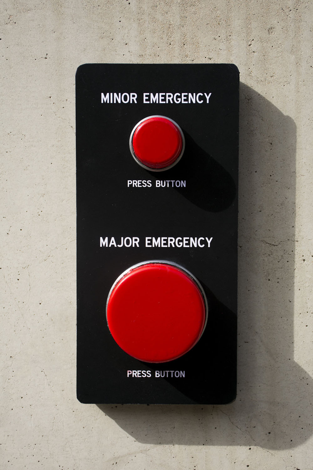
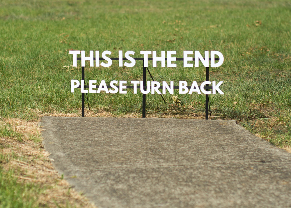
My artists name is Michael Pederson and he puts around public places in Sydney street signs that are supposed to be funny and some of them are camouflaged in to look like real street signs. He does have an Instagram which shows different signs he has made in the past around town. https://www.instagram.com/miguelmarquezoutside/
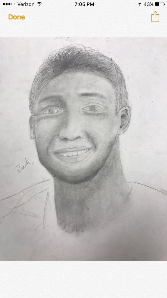
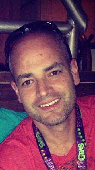
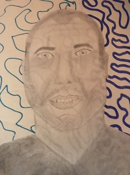
For this piece I picked pencil as my medium, I sketched out everything first and then I added detail to the face such as shadowing, scars, facial hair, smile lines, wrinkles. I picked my dad for this project because he doesn't have much hair because he shaves it all off and I have never been good at drawing people anyways especially hair.
 Who made it: McKenna
What medium they are using: Pencil What's next: My partner is planning on cutting out strips of magazine to make a background for her portrait piece
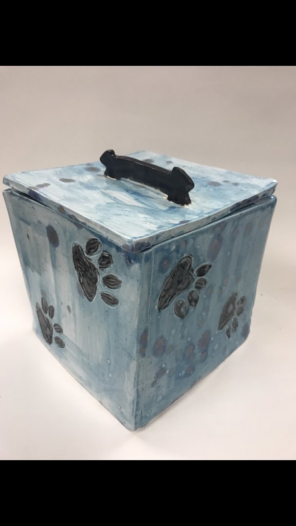
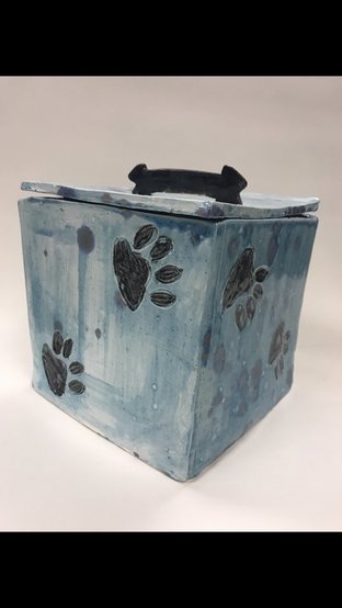
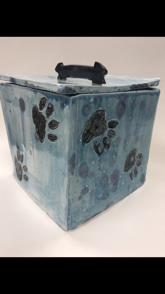
I created a clay box for my sculpture project. What I did to create it was roll out slabs of clay, then cut out the shape that I needed for the clay with a stencil and used slab to put them all together. I then let it dry and get fired once so after it had been fired once I was able to paint it with a glaze. Once I had glazed it, it was ready to be fired again, after it was fired for a second time the piece was finished. I got the idea of doing a box because I thought it would be cute to put dog treats in there instead of the card board box that the treats come in. I don't like this piece at all that I created to be honest. It's not all the same length and the lid and the actual box curve up on some of the corners. I don't like how the glaze turned out it kind of turned out splotchy, the only thing I do like about the piece is the dog bone as the handle that's really the only part I thought turned out good.
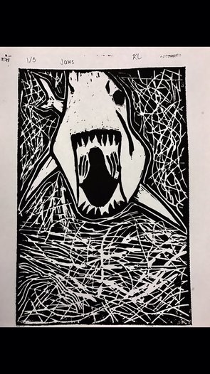 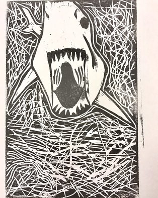 What I did to create this piece was carve out markings in a sheet, what I had carved out would be white on the paper, and what I didn't carve out would be black ink. I incorporated lines in this project because the water which is the background of the piece I did a bunch of random lines because when a shark swims the water moves so I tried my best to make it look like water was moving from the tail swishing around. I honestly don't think I would change anything, I like my thought behind the random lines for water and even though I didn't carve all the way out for the top picture, because it shows some black specks I missed I really like it because sharks are usually a little cut up and it gives it character. The top picture is my best of the printmaking and the bottom picture is my worst of the printmaking.
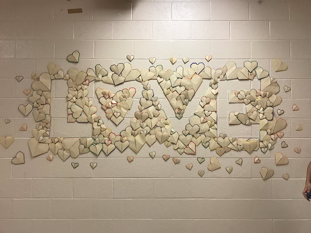 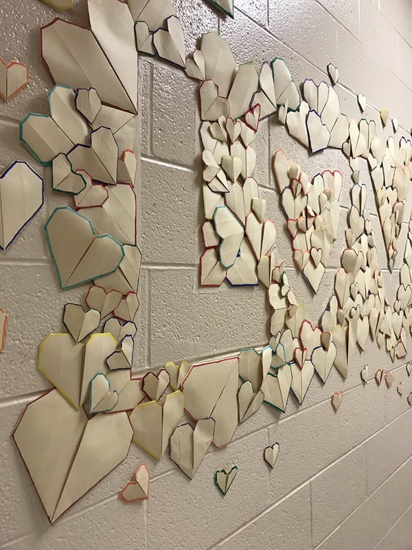 I missed two days while creating this project but I do know some things about it. In this installation we created in big letters, out of origami hearts, the word LOVE at the end of a long hallway. I think we made this installation successful because from what I heard everyone was making the hearts, and from what I saw on everyone also participated in hanging up the hearts. If we did it again I would add more color such as doing different colors of paper, or doing a thicker lining on the pictures so you can see it from far away. I think this because some of the colors even fitting the whole word in don't really show up good, so even from the other side of the hallway I don't think you'd be able to see it well.
|
Inspired Artist
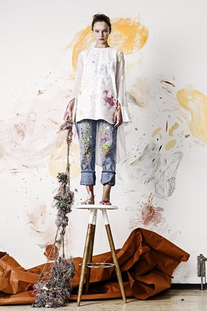
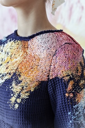
The artists who inspired me are designer Olya Glagoleva who did a collaboration with a artist named Lisa Smirnova who is Russian. They design clothes that have been embroidered to look like paint splotches and patterns. The thought they had behind the clothes they have designed is that you're very likely to have paint or other art supplies splattered on you by the time you're done with your piece, so they have now created clothing to make it look like this, but instead using a stitching design that Olya and Lisa call Paint Splotch Embroidery. These artists grabbed my attention when scrolling down the page because their work looks like they just came out of a art class that had finished painting. It looked so natural I was intrigued by what it was.
|

 RSS Feed